Sunday, October 1, 2023
Ideas for a Studio Remodel by Carol Nilsen1
>
My studio space used to lack light, space, and storage. It worked, after a fashion, but my workspace was small, the ironing area had to double as a cutting and composition area, the lowered ceiling and tiny window made it seem cramped and dark, and my design wall was a piece of foamcore on an easel. I knew I was lucky to have the space, but it was far from optimal.
As time wore on, though, I longed for more light, a larger work surface, an ironing area that didn't have to double as something else, a permanent design wall that didn't wobble when I pinned into it, and much more of storage.
Enlarging the window was the biggest task, followed by raising the ceiling.
Midway, it looked like this:
Now, the cabinets are Ikea kitchen cabinets, 40" high in the upper areas, 30" high under the counters, with 25.5" quartz countertops. The work surface is double that width, or 51", because, as is easily seen in the photo, two sets of cabinets are installed back-to-back in the work peninsula.
The sewing machine is atop 6 shallow drawers, also capped with a separate quartz counter at desk level.
The rest of the counters are at regular counter heighth with drawers of about 10" depth, although one column next to the machine also has shallow drawers, making for easy viewing of threads and tools. In a dead space in the opposite corner, we tucked in a built-in trash receptacle.
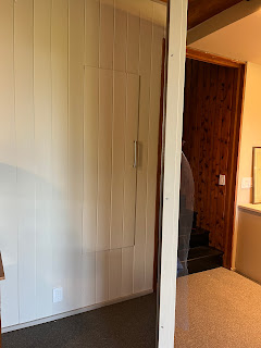
The new design wall is actually a hinged board topped by a single piece of 5/8" felt. By hinging it, 2 needs were met: When the design wall is swung open, I still maintain access to a cupboard that has long housed bolts of fabric for dyeing and felt. And, by opening the design wall at different angles, I capture differing lights, an important consideration when working with silk sheers.
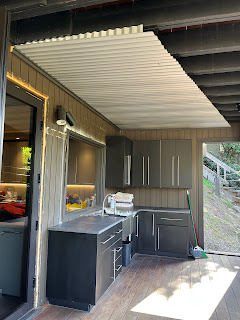
Finally, on a deck just outside the sewing area, is my wet studio (also dog washing station!). In the second shot, note the roof protecting the cabinets (also kitchen cabinetry from Ikea) from runoff from deck above.
In all, it's an efficient and practical layout and an absolute pleasure to use, even if, despite all of these great improvements in workspace and storage, I still seem to have fabric and tools scattered all over!


Looks heavenly Carol! Nicely designed!
ReplyDeleteWhat a wonderful space, thanks for showing us around!
ReplyDelete