Monday, May 30, 2016

Digital Design On Fabric

I muse over life I capture through the lens. Inspired by global travel, my current work is developed through digital alchemy, printed on natural fabrics and enhanced with surface design. I strive to create imagery with color, pattern and repetition to produce a magical moment in time.  
 In ACN’s last call for entry, “Anything Goes”, my juried piece was digitally developed in Photoshop with an image of a Vietnamese girl working on a tourist boat. 


After printing on sumptuous silk charmeuse, I applied potato dextrin and thickened dyes. Her Tapestry (30x60) depicts a woman’s simple life working day to day on the Mekong River, “a tapestry to feel & see, impossible to hold”.  

Most recently I created art quilts with a water theme.  I will take you through a series of steps to give you a better understanding of how this process works.
In this example I began with a photo I took while at the Amazon in Peru.
Next I went into an app www.picmonkey.com and redesigned the photo
Next I went into a folder of scanned images I use to layer the design.  I chose a fabric I had stamped (Hand-carved) with inks.

This is the result of adding the layer.

Working with the same app and photoshop I eventually got this result and had it printed on cotton.

 I enhanced the piece by painting with metallic inks and fusing with foil.  I free-motion quilted and bound.  
                                         
 Can You Hear Her Calling? (23x36).
Over the past 15 years I have intensely focused on learning about and working with dyes and numerous surface design techniques on natural fabrics as my canvas. Coupled with a passion for photography, my current work utilizes both mediums through digital technology. After exploring digital design and printing on my own, I took a full time class at RISD in Providence R.I., followed by classes at Cape Cod Art Association and Quilting Art Quilt Tahoe (Jane Dunnewold). I am passionate about creating digital design on lustrous silk and other natural fibers as art cloth and quilts.
I hope this gives you a better understanding of how this works.!


Sunday, May 1, 2016

Keeping Track of Color

I admire the work of artists who work spontaneously and successfully build on surprises but regrettably, I am not one of them.  I am much more a planner/implementer/control freak.  Here is how I document dye color formulas so I can get exactly the color I want.


With paint, mixing the color you want is straight forward:  the color you have mixed will be the same when applied, allowing a bit of shade change for wet to dry.  With dye, it is not so easy.  The color you see when you mix the dye bath only has a general resemblance to the color you will get when the dye process is complete.  When I have tried to adjust a color bath that seems wrong by adding more dye colors it has never turned out well!  Unfortunately, What-You-See-Is-What-You-Get does not apply to dyes.

The only way to really have control of color is to test and keep accurate records.  Obviously, a swatch does you no good if you don’t remember what you did to get it.  For this, you need to measure accurately and keep notes.  I use a gram scale that reads decimals to mix stock solutions with graduates and syringes to measure as accurately as I can, but use whatever works for you.  Write down what you did immediately—it all goes vague and fuzzy really quickly.

Once you know what you mixed and have a swatch of the final result, it’s time to put it into a reference bank so you can always find that information in the future.  After several false starts, here is how I now store my reference swatches.

I use blank cardstock that is perforated for making business cards, but anything stiff enough will work.  I wrap a 2” x 3” swatch around the card and tape it down.  The formula is written  on the card.  I include the strength and percentage of each stock color so I can easily adjust to different amounts of fabric.

The payoff for all this documentation is you always know how to get that fabulous burnt pumpkin or vibrant limeade color again.  If you want a new color, reviewing the formulas used previously will give you a good start on how to adjust them to get the desired new color. 

Happy swatching!

Wrenn Slocum


Friday, April 29, 2016

In Southern California???

Please come out for my big SOLO show of textiles and mixed media work.    Three GIANT installations, art quilts, mixed media/fiber wall work and much more.   There's a short MP4 explainer on my blog (fiberfly.blogspot.com) to whet your appetite!


Monday, April 18, 2016

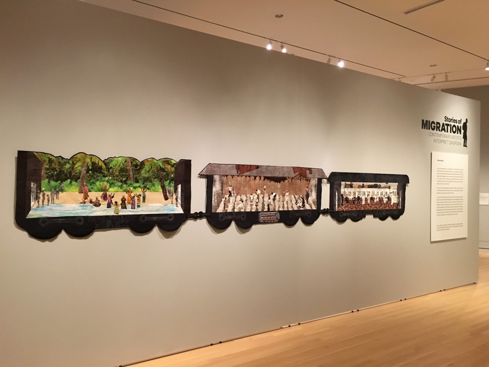
Stories of Migration: Contemporary Artists Interpret Diaspora

 Joy Lavrencik and I attended the opening of this exhibit at The National Textile Museum at George washington University in Washington DC this weekend.  It was a wonderful exhibit in the musuem's new space. There were several events over a 2 day period. We got to meet   many of the other artists in the exhibit and get to know them and their art better.  The curator explained to us at one point the development of the call and how they worked together with SAQA (Studio Art Quilt Associates).  I found it an opportunity to work in an entirely different way. It was quite an honor to be included.  Here are some photos from the exhibitand a link to the Museum. There is a catalog available for $20.

https://museum.gwu.edu/diaspora

Stories of Migration


Sunday, April 10, 2016

Art Quilt Elements 2016

The Art Quilt Elements exhibit at the Wayne Art Center had an opening reception on April 2, with a full house. The venue is a beautiful stone building in a lovely suburb of Philadelphia. The exhibit dates are March 18 - April 30, 2016. If you can get to the show, it is rich in variety and well worth viewing.

Three Art Cloth Network members were juried into the exhibit. Judy Langille and Jeanne Marklin attended the opening and were able to talk for a few minutes. The opening was packed! Approximately 6 quilts sold on opening day. The color in the catalogue is much improved from past years and is well designed. It can be ordered on the Wayne Art Center website.

The surface design techniques of the ACN members were featured in each of our work.

Judy Langille in front of her work "Ancient Composite 1". 62" x 34"


The piece is composed of silk noil and linen. Langille screen printed the silk, used shibori style dyeing and hand pieced it. There are many French knots on the surface. Her artist statement:

"I am interested in ancient manuscripts and writings that are part of the historical memories of my ancestors. These "writings" in my work represent memories, both forgotten and recollected. The marks are sometimes screenprinted, and other times created by the use of shibori. Stitching in the fabric creates a texture, which implies that there is great detail in every life or story, held closest by those who lived it."

Marklin's work is titled "Blooming", and was made with snow dyed cotton fabric and machine pieced and quilted as well as fused.
"Blooming" 37" x 29"
She wrote: "Snow dyed fabrics have called me to showcase them and give others the opportunity to dream about them. They bring visions of under the sea, lichen and agates". 
At the opening, she stated that the patterns in the fabric remind her of the sense of awe we feel in nature, when we wonder how complex patterns came about.

"Leaf Fall, Oak Leaf Tangle" by Barbara Schneider. 50" x 25" x 6"

Schneider's artist statement for the piece: "I continue to explore the beauty of leaf shapes, textures and markings. I like to collect them at the end of summer when they have begun to wither and fragment. Looking at them closely and then enlarging them allows me to see them as sculptural objects. I look at the play of light upon surfaces, and shaping the pieces introduces a new element - light and shadow interacting with the undulating surfaces."